This week we finally get to a fun topic: data visualisation.
There’s more to data visualisation than I could possibly cover in 90 minutes
I focus on static, two-dimensional visuals
These are the kind that you are most likely to use.
Theory & Motivation
Visual Summaries as an Aid
Returning to the theme of this course, the aim of much of data science is to understand the whole picture of your data.
If you can do this without reading your entire dataset, all the better!
When making data visuals, I think it’s helpful to remember that they are, in many ways, a form of summary.
Visualising data is not just about communicating results; it is also a powerful tool for you to understand important features of your own data.
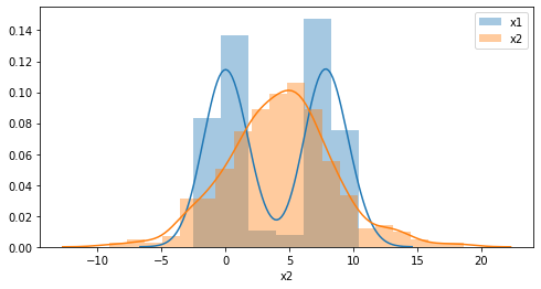
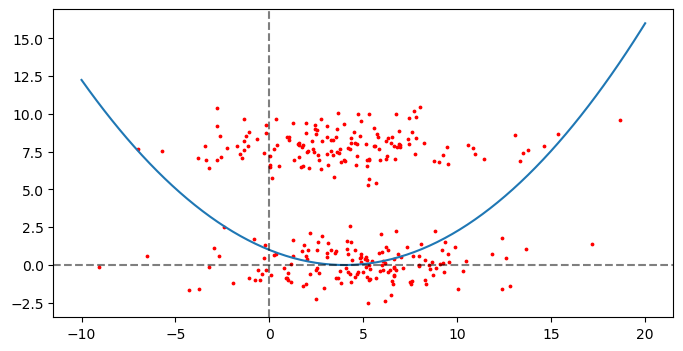
Motivating Example
x1
x2
count
300.000000
300.000000
mean
4.048335
4.066768
std
4.145384
3.908675
min
-2.304990
-6.892820
25%
0.102002
1.528010
50%
3.389367
4.125494
75%
8.039512
6.871554
max
11.230459
16.889281
Motivating Example
The same data
From Data Types and Structures to Visualisation
Data Types/Structures
The type and structure of your data tells you what type of figure you need:
Number of Dimensions
Ordered or Unordered?
Discrete or Continuous?
Visuals on a Two-Dimensional Medium
Most figures are created on a two-dimensional plane, where the dimensions are usually referred to as X (width) and Y (height).
These axes are the most versatile; they can be used to plot any kind of variable. The only trade-off is the overall size of the figure is determined by these two dimensions.
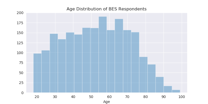
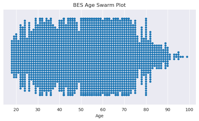
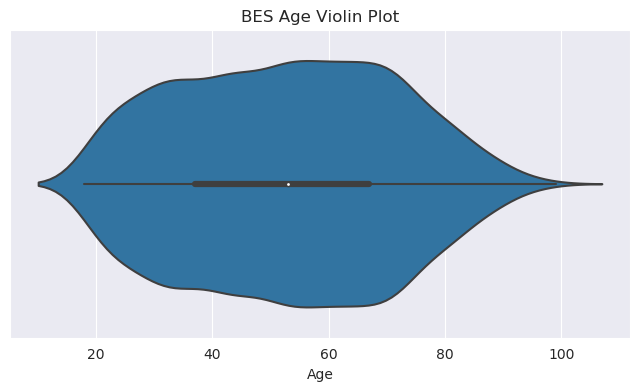
One-Dimension: Distributions
Visuals for one-dimensional data tend to be concerned with distributions; i.e. frequencies of values along some dimension.
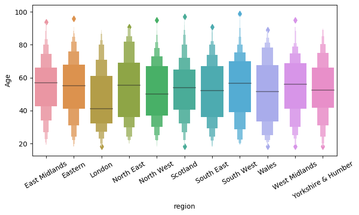
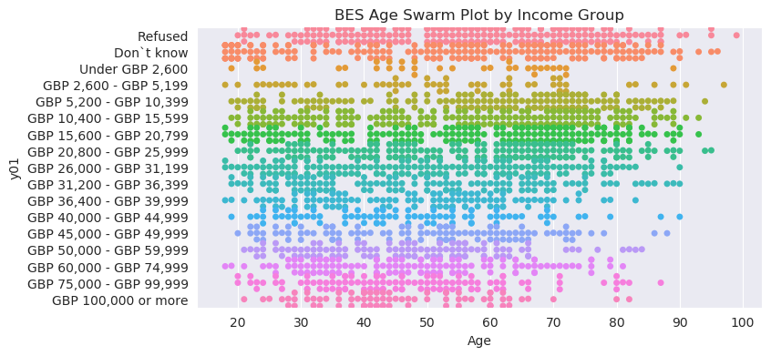
Panelling is the use of multiple sub-plots within a single figure.
Panelling can only show variation along a discrete variable.
The order of the plots can be used to show variation along an ordered, discrete variable.
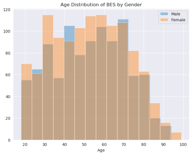
Other Ways of Showing Variation
Colors and panelling are not the only means.
Shapes can be used to show categorical variation.
Size/thickness and transparency can be used to show continuous variation.
Take-Away
When visualising data, ask yourself the following questions, then look through galleries to get an idea of what could work for you.
Are you:
Making a comparison between groups?
Trying to show conditional relationships between variables?
Exploring your own data?
Implementation
Two Libraries
matplotlib is the primary library for building data-based visuals in Python.
Requires a lot of explicit commands to get it to look good, but allows for nearly complete customisation of all aspects.
seaborn is a more recent library, built on top of matplotlib.
Provides fast and convenient methods for most figures you will ever need.
Both libraries can be used in conjunction.
The Anatomy of a Data Visual
On the back end, all matplotlib-based visuals adhere to a similar tree-like structure. By learning this structure, you can locate and customise any element of a figure.
The Matplotlib Hierarchy
Here is a truncated version of the matplotlib hierarchy:
Figure
Figure-level Methods (e.g. Title)
Axes (Subplots)
Subplot-level Methods (e.g. sub-title)
Graphical functions
Graphical primitives (shapes)
Axis pairs (x-axis and y-axis)
Axis labels
Axis ticks
Location
Labels
Legend
Figure
The figure is essentially the “canvas” upon which all visuals are made. Some parameters/methods set at this level include:
Total size (in pixels)
Super-title
Saving to file
Axes (Subplots)
Subplots are the frames within which individual visuals are contained.
Most drawing methods are called at the subplot level:
Plotting (drawing the graphical objects)
Individual plot labels
Legends
Graphical Functions
matplotlib and seaborn provide an enormous number of plotting functions. These functions:
Take one or more equal-length vectors as inputs (the data).
This data may be in long- or wide-format.
Draw objects accordingly to the relevant subplot
If the function is a matplotlib function, you should call it as a method of the relevant subplot.
If the function is a seaborn function, and there is more than one subplot, then you should pass the relevant subplot as a parameter to the function.
Customisable Aspects
Graphical objects take a large number of customisable parameters, such as:
Color
Transparency
Line/dot style
X and Y Axis
Subplots have xaxis and yaxis methods. Call these to customise the following aspects:
Ticks (the little notches along the axes)
Spacing/interval
Labels
Text
Orientation
Top/Bottom, Left/Right
Axis labels
Anatomy, Again, with Examples
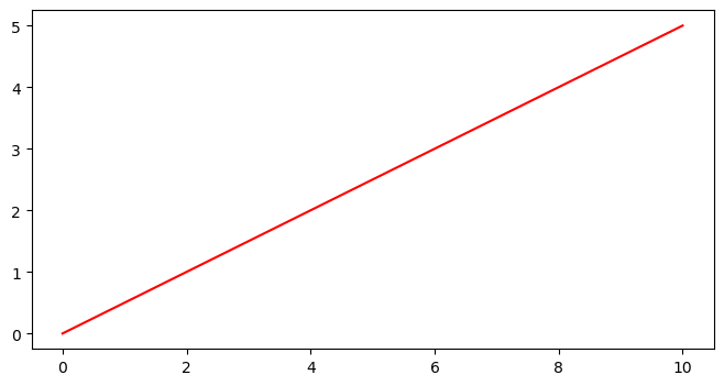
Figure
import matplotlib.pyplot as plt
f = plt.figure(figsize=(15, 8))
This does not create any visible objects, but it lays down the canvas that other things will go onto.
Note:
Most of the plotting functionality is within the pyplot module of matplotlib.
The output of plt.figure has been assigned to a variable, f. This will be our means of accessing the figure and its methods.
The parameter figsize=(15, 8) has been passed to plt.figure. This tells matplotlib to create a canvas that is 1500x800 pixels.
Axes (One Subplot)
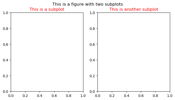
f, ax = plt.subplots(1, 1, figsize=(15, 8))
f.suptitle("This is a figure with a subplot")
ax.set_title("This is a subplot", color="r")
Figure with 1 Subplot
Axes (Two Subplots)
f, ax = plt.subplots(1, 2, figsize=(15, 8))
f.suptitle("This is a figure with two subplots")
ax[0].set_title("This is a subplot", color="r")
ax[1].set_title("This is another subplot", color="r")
Figure with 2 Subplots
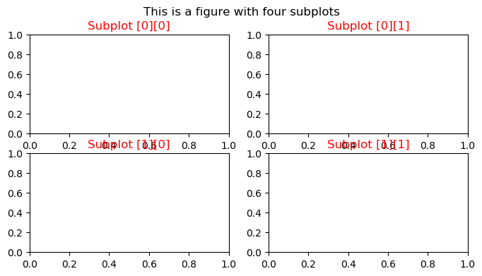
Axes (Subplot Grid System)
f, ax = plt.subplots(2, 2, figsize=(15, 8))
f.suptitle("This is a figure with four subplots")
for i in range(2):
    for j in range(2):
        ax[i][j].set_title(f"Subplot [{i}][{j}]", color="r")